|
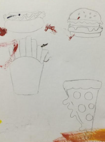
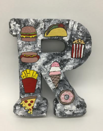
The topic of the last artwork was identity. Before we started creating our artwork we had to write down things that we liked and took interest in. For my final artwork I chose to make an architectural letter. I chose to make the letter "R" because of my first name. The materials used were a thicker paper, paper cups, paper tape, acrylic gesso, and acrylic paint. I decided to paint the fast foods burger, hot dog, fries, pizza, popcorn, donut, and ice cream. The background of the letter is painted a black, white, and grey marble color; with black and white paint splattered all over it. I watched a video on Blick and it gave me directions on how to create the letter. The reason for putting fast food on my artwork is because it is delicious and I wanted my letter to bring a happy feeling. I most enjoyed doing the marble because you could really play around with how it looked. Something I learned from creating this artwork is it is okay to switch up your artwork. The one thing I wish I could change about this artwork is the way the letter stands because it is very tippy.
0 Comments
Leave a Reply. |
AuthorHi my name is Rachel. My favorite colors are blues, oranges, and yellows. My favorite food is pizza. Archives
June 2021
Categories |
 RSS Feed
