|
My favorite artwork we did this semester was screen printing. I loved doing screen printing because it was easy enough to understand and do. I loved the colors on the white shirt I use for my print. I also think that it didn't have very many complications or dislikes. If I could redo any of my artworks I would redo the portrait I did. I didn't like the way the shading turned out on the face because I feel like it was everywhere and it didn't look neat. I think that the other portraits that I have drawn at home look way better and more neat. Another thing was I thought the eyes, eyebrows, nose, and the mouth were to small for her face. Something I learned in class was how to stay on top of things and that sketching ideas is okay and can be helpful. I can use this in other classes and even outside of school for helping me stay organized. Being organized is a great trait to have. I think the one thing I would've wanted to do in art class was enjoy other materials that I wanted to use like watercolors and chalk pastels. I didn't think any of my artworks that I did suitied any of the artworks we were assigned to do.
0 Comments
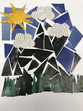
Standards EvidenceI think my artwork for this final project was similar to Frank Big Bear. Frank Big Bear does artwork based on personal life, like family and cultural life. I based my artwork more on my personal life because one day I want to go hiking in the mountains with my family. I also think my artwork also relates to Leah Yellowbird because she uses acrylic pain in ton of her artworks. Leah Yellowbird uses a dotting method to look like beads. I used acrylic paint like her in my artwork but I never used her dotting method. Art always has a story behind it and creates memories for the artist. Memories is what helps create interesting art along with experiences. Leah Yellowbird uses the dotting process because it looks like beads just like the ones she used when she worked for her aunt as a bead-worker. I believe that art is the best and the most valuable when it something that brings you back or reminds you of something you have done or experienced before. You Behave differently to an artwork if weather you do or don't have a connection to the artwork. Artist StatementArt 2D had to make a final artwork that was personal or important to us. I decide to use acrylic paint as my material on a canvas. The artwork is a picture of a sun setting behind some mountains and my family (Mom, Dad, Travis, Carter, Tayiah, Colton, Kahlee, and me) climbing another mountain. I chose to do this because this would be one of my dream vacations to go on with my family. I call the art work "This is What I Call Home" because it is with my family and where ever my family is my home is. My family inspires me everyday by just being them that's why I wanted to base my artwork on all of them. I think this artwork reached the goals I wanted it to because it shows something more personal. This artwork won't necessarily influence future artworks as much as it will influence me to live life and explore new things with the people I love. I think the hardest thing(s) to do were the mountains because I didn't know how to shade them or if it would be color or if it would be a silhouette. My Final (Final) Artwork: My Sketches for Final Project: Standards EvidenceThe name of my artwork is school girl. This artwork I guess you could say is for any girl who goes to school. I think this artwork is the best fit for girls who go to school as my audience because I think that they will enjoy it most. I also think that it is a good amount of people see it. That's why I put my artwork between the lunchroom and the girls locker room. My artwork doesn't have much of a meaning other that an ordinary girl who goes to school. My artwork is very original tho because I chose to draw a portrait freely. No one has drawn the same exact drawing as me which is what makes my artwork original and different. I think my artwork doesn't really tell you much, but the fun thing is, is that you can create your own story behind the artwork which is kinda nice. I think that this artwork is meaningful in some way, but I also think to other people it can be more or less meaningful depending on how much you love or hate school. Artist StatementThe second to last artwork for 2D art was portrait. For our classes choices we could create a portrait of a famous person, family member, friend, or create a portrait of whatever you wanted. I chose to create a portrait of whatever I wanted because I like the suspicion of what the portrait will look like in the end. I chose to use drawing pencil for my media because painting or any other material would've took me way too long to finish my portrait. I liked this artwork because I draw portrait drawings at house. I like the way my portrait turned out, but I feel like some of the ones I have drawn in the past are better. The hardest thing for me to do were the eyes and eyebrows. I have always struggled with making them look like one another, and because I struggled I drew and cut out my eyes and eyebrows on a separate piece of paper, and then traced them on my portrait. I think my favorite thing about my artwork is the brick wall behind her. My Final Portrait Artwork: 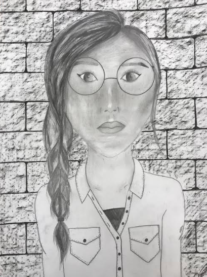 My Sketches For My Portrait Artwork: Printmaking2D art had to do printmaking. I chose to screen print. I think that screen printing was my favorite thing we did this year so far. At first I had a little trouble figuring out what to do, but in the end I chose to do something with mountains. The hardest thing was cutting the image out, because of the the way it was shaped. The process is done by drawing something you like. Next you trace it with sharpie. Then you transfer it to a transparent piece of paper. The fourth thing you have to do is use an exacto knife to cut out the part you want printed on your shirt. Next you grab a shirt and an ink color of your liking. Then you have to grab a mesh screen and tape the transparent paper on, and cover up the parts of the screen you didn't to get ink on. Finally you center the design on your shirt put ink on the screen, and use a scraper to move the ink around. I loved the results and I would definitely do this again. Designs: The Final Screenprint: CollageFor the collage project we had a series of 10 steps that we needed to follow, but before that we had to go into magazines and tear out a list of stuff that was on the board. Collage is sticking materials onto one piece of paper. The materials could be paper, fabric, paint, or pipe cleaners, etc. It wasn't my favorite thing to do though, because I like to choose what I get to create for the media. Overall though it was fun. I didn't have any trouble at all with my collage. For my collage I chose blue and green for my background. If I was able to choose the way I did my artwork it would probably be something outdoorsy, because I love the lake, mountains, and trees. I think I might do more with college, but I also might not because I like drawing and painting the best, which is probably a reason that I use collage again. Final Project: 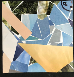 Target EvidenceArt 2D had to come up with a landscape idea. It could be a seascape, cityscape, countryscape, etc. I chose to make a mountainscape. My artwork isn't inspired by anything. When we were assigned the new artwork project I new right away what I wanted to do. I first thought of a cabin by some mountains that would have a trail going down it but I didn't go with that idea. At first I was going to do watercolours but instead I went with drawing pencils. The reason for not doing the watercolors was because it wasn't going the way I wanted it to look. The drawing pencils were easier to use anyways so I went with that. The material wasn't really a challenge to use but drawing the deer and the pond were. I had two people from the art room say it looked good, and then I had a few family members and two friends from outside of the classroom say that it looked awesome. Mrs. Underhill said that she loved the shading on the mountains and how realistic the trees looked, but she said that my house should look more 3D instead of flat. Which I used the feedback and made the house look a little more 3D, because I also agreed with her. I took a look at pictures and videos to lean how to do the mountains (https://www.youtube.com/watch?v=b0l2a7fnScI), the deer, the birds, and the lake. My favorite part of my drawing is probably the mountains, because I think I did a pretty good job with my shading. I think overall I like how it turned out good, and I think the only thing I would change is how the house looks, because I had to add on instead of erase too much. Some of the images I looked at: What I did in my sketchbook: Artist StatementMy artwork is a pencil drawing in the background there is a flock of birds, three mountains and in front of that is a house and a lake with pine trees surrounding it and a deer also by the lake. The title of my artwork is called "My Home." I went with this title because this would be a place that I would live. I used the material drawing pencil, because it is good for shading and I enjoy using it. I could of used watercolours but, I decided to do an artwork with watercolours that had less detail. The only technics I used was shading and a little bit of ruler on the house. For the landscape I was excited because, I knew exactly what I wanted to do. Overall I think I did a good job because most of my artworks from last year took me longer when they didn't have to. For this unit we have to make some sort of landscape. I am doing a mountain landscape. I am using pencils, but originally I wanted to use watercolors. The reason why I didn't do watercolors is because it was way harder to get detail, and I also thought it just wasn't working out the way I wanted it to. I want the drawing to have a house with mountains in the background, a lake, trees, and a deer. I think the hardest thing to do will be the lake and the deer. So far I had two people give me feedback saying it looks good. Mrs. Underhill also gave me feedback. She said that my house should look a little more 3D rather than a flat house. I agree with her and I definitely think I will use the feedback she gave me. I think so far everything is going pretty smoothly, and I am most proud of my shading on the mountains. I didn't really have an inspiration for this project, but when Mrs. Underhill said that we had to do an artwork on landscape my mind immediately knew exactly what it wanted to do. At first I envisioned a cabin by some mountains with a path going up them, but when I started drawing in my sketchbook I decided I wanted to make the artwork a little more challenging and scenic, so I am going to put in some sort of water feature in my artwork. Target EvidenceI came across the idea to create object by the shirt I was wearing that day. The shirt seemed like it was at night and outside, so I decided to do something cool with a night time theme. I started out with the material, chalk pastel, but it wasn't really what I wanted it to look, so I went with acrylic paint instead because it was easier to blend with, and you can create more colors with it. The hardest thing was probably the moon, because when I tried it on paper it looked a little more the way I wanted it to then on the canvas, but in the long run I think it turned out really good. I tried different techniques for the trees in my sketchbook and the stars. I even tried out different shades for the sky. I looked at other peoples paintings on the internet and took some of their ideas and combined it with my own. I looked at some Bob Ross paintings to for trees (Link To Bob Ross Video: https://www.youtube.com/watch?v=-HvdsIkY9mY). I wanted everything as perfect as I could get it so, I work 5 or so days on just practicing alone. One thing that I should of changed was the spacing between the trees on the right side of the moon and the shading on the trees. Artist StatementFor my artwork it is a starry night sky with the moon in the center, and trees on either side just barely overlapping the moon. My title for this artwork is called "Pine Trees At Night." I went with that for the title because it's a painting of pine trees under a moon lit up sky. I used the material acrylic paint because it was easy to mix colors, and because the chalk pastel that I was going to use didn't turn out the way I wanted it to. I use a regular sized paint brush for the background and moon, a fan brush for the trees, and a toothbrush for the stars. I got the idea from the shirt I was wearing the day we had to come up with an idea to use for the project. It was an outdoorsy shirt so I went with the idea of pine trees under the moon. I thought it also went with my personality, which is being outside and exploring. I think this artwork helped me become more of an artist because I tried different materials and tried new things. I think the I learned that it is okay to try new things even if you don't know the outcome. I think the artwork is a little different then I imagined, because nothing will ever exactly the way you think it will. I think I should've probably filled in between the trees on the right side of the moon, but overall I think my artwork turned out pretty well. For my object art project I want to do pine trees shining under the moonlight and stars. I looked at some other artists work to find different and more realistic ways to paint the trees, the moon, and the stars. I will be using acrylic paint for my material. I was going to use chalk pastel but it didn't turn out the way I wanted it to. I have had been practicing a ton of different ways to make my project look good. I made a few observations on how the moon looks in a few different pictures. I also look at how most people made realistic stars. When I first tried to make the moon I started out with a black piece of paper and I used watered down white and black acrylic paint and I think it worked really well. For the stars I tried a stiff bristle paint brush, a tiny paint brush, and a toothbrush. I am thinking of using the toothbrush because in my opinion I think it works best. So far everything is going great for my project. 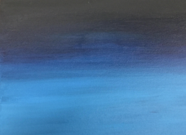 In the media fair we used tons of different materials such as charcoal, drawing pencil, erasers, ink and pen, colored pencil, chalk pastel, oil pastel, acrylic paint, watercolors, and collage/ composition. I enjoyed a lot of the different materials but for some of them they weren't my favorite. What surprised me about the materials was how much I liked some of the materials I didn't think I would like, such as collage, chalk pastel, and colored pencil. I would use the materials charcoal, drawing pencil, erasers, colored pencil, chalk pastel, acrylic paint, watercolors, and collage/ composition again. I enjoyed all of the different materials, and i would use them again because I had fun with the materials. The materials that I would not use again are ink and pen because I have a set like that, and it worked better for me with the ink and pen I have at home, and I would not use oil pastel again because I didn't have fun with it like I did with the chalk pastel.
As an artist right now I still have tons of things to learn. I like to draw with pencil the most. I hope to learn more about drawing and better ways to draw certain things. I am very willing to take different risks. I don't mind watercolours or acrylic paint, but my least favorite thing to do is mixed media art. I want my goals to be trying things that I don't normally use. I want to try my best and I don't want to give up when something doesn't look right.
|
AuthorHi my name is Rachel! I enjoy be outside and hanging out with friends. Archives
January 2020
Categories |


 RSS Feed
